Post by Yoona Im on Aug 13, 2015 7:42:52 GMT -5
Welcome All Stars.
Emmy isn't with us this week. But we have the rankings from all of the other judges so it's time for the judging and also the elimination. The first official elimination cause previous two weeks, the models withdrew from the competition.
Based on the poll, Janet & Sofia were tied as the weakest model for the week. But it's all about the judges' ranking. Let's start the judging.

Ayu: This is why you won your cycle. It's a clean, flawless magazine cover. Everything is on point. If I had to nit-pick, I'd like just a little bit more neck.
Yoona: Well I didn't like it. I love it. This is gorgeous. The pose, the styling. Everything is just on-point. Other girls better watch out now. Great job, Angela
Jensen: *gives up* no sense in critiquing you any more, just copy and paste everything I say about you. Perfection and gorgeous.

Ayu: The first thing I noticed about this is how strange your face looks - I mean, it so photoshopped on, like, to the point where it looks like they shopped her face back in to her body. I like the dress, but I don't like the pose. But it's a pretty good cover on its own.
Yoona: I'm glad you chose to be edgy this week. I think you need a risk. And this is very risky. Yes, it's not hundred percent working but I love this side of you. Be careful with the expression. I really like the concept of this photo. Good job, Anna
Jensen: Expression sucks, picture is great though.

Ayu: Tiny error in quality due to it being a JPeg, but I'm just nitpicking. I like it Anne. I think it's flawless.
Yoona: It's very smart for you to pick something from Harper's Bazaar cause the last 3 best photos were from this magazine. This is beautiful. Not a fan of the angle. But this one is definitely better than your first two photos. Great job
Jensen: Quality sucks, picture is great.

Ayu: Ah, W magazine. We meet again. W magazine doesn't seem to go over well here. Usually a bit too on the avant garde side. While this is definitely on the avant garde side, it's not to over the top. I really like the face here, but the hair, not so much.
Yoona: I disagree with Ayu. I love the hair. So edgy and creepy. I love it. Overall concept is brilliant. I'm a fan of this cover. Great job, Christina. Keep it up.
Jensen: Christina................she's out to win this shit!!! Amazing!!!!

Ayu: It's a simple cover, and I love the face, and the top. The skirt is heinous and cheap-looking, however. I don't particularly like that half-half necklace either. All together, the cover is good, but not exactly the most impressive.
Yoona: Yeah, the top is so gorgeous. The color looks so good on you. And I love this hairstyle on you. I think you could soften your expression a little bit but overall, I like it.
Jensen: Love this!!! I just love it. Good job.

Ayu: I love everything but the face. I adore that dress, and I want to own it. The pose is standard, but works in selling the dress. But those eyes. They're lifeless. There's not really any true happiness, but rather forced. Are you there against your will?
Yoona: I like this. This is gorgeous. I 100% disagree with Ayumi. I can see your personality in this photo. You look fun, fresh and fabulous. Love the outfit as well. Great job.
Jensen: I don't like your face here, I do see personality but the cheeks I just don't like.

Ayu: I love a good beauty shot, and this is a good beauty shot. You've done a great job in editing this. I think it's great. Plus, I will be on top.
Yoona: Yaasss. This is gorgeous. I love it. Strong face and your eyes are freaking beautiful. Well done, Imogen.
Jensen: Beautiful!

Ayu: Janet's face is definitely an acquired taste, and it's a taste I have yet to acquire. I'm not sure I was ready seeing it this close. Apart from that, I think it's a good beauty shot, just, you know, not a fan of your face.
Yoona: A little bit torn on this one. I really love some parts but the other parts, not really. I really like the concept and I love how you tried to soften your expression but I still don't think it works perfectly. I'm worried for you this week.
Jensen: I don't like this at all, sorry

Ayu: I love the dress, the jewellery, but my god, are you orange. I can't tell whether that's fake tan or sunburn. The eyes are also disconnected. They appear to be intense, but they are just staring straight past the camera to something else. It takes away from it a bit.
Yoona: Yeah.. that was the first thing I noticed as well. Your skin looks so orange-ish in this shot. But other than that, I think you nailed it. Gorgeous styling and dress and I love how natural your pose is. So good job.
Jensen: I don't see orange at all :X Maybe a tad pink, the lighting obviously but I don't see orange. Your eyes are amazing. This is a great picture.

Ayu: Paying homage to Ms Frost, I see, Laura. It's a clean and clear cover. I like it, but the mouth should be closed. It would've gave this a lot more power.
Yoona: Gorgeous. Effortlessly stunning. Great job Laura. I just love how simple this cover is.
Jensen: Quality is not good but I love how much you look like Jennie Garth here. She is the Queen. Very cute.

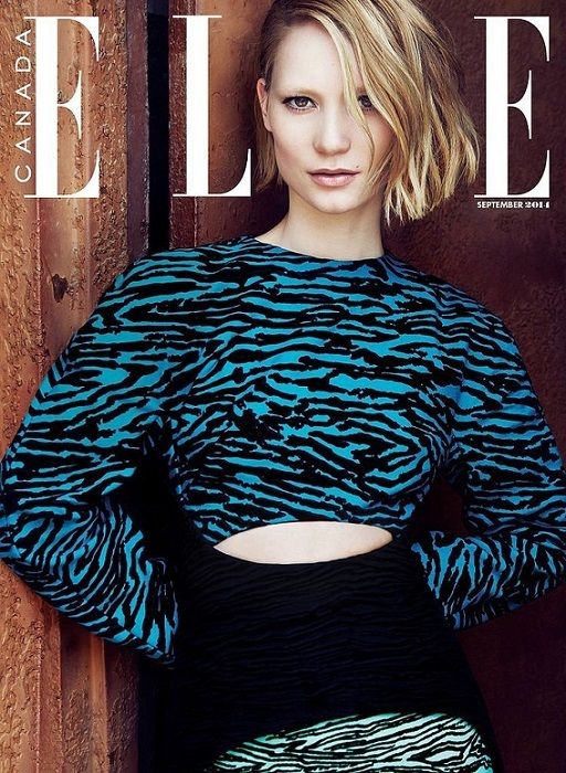
Ayu: I like the face, but at the same time I don't. But that's good, because Alienesque is a good thing in fashion. The fashion itself on the other hand, I'm not too crazy about. I don't like the pose that accompanies it that much neither.
Yoona: The top somehow reminds me of Imogen's skirt last week. Don't know why, but I'm not a fan of the styling. The combination looks off to me. But I like your face. It's weird but in a pretty way. So good job, Mia
Jensen: The hair looks greasy and stringy but the photo overall is cute.

Ayu: Oh Paloma, I appreciate the personality, but please don't do this again. I don't know if I like anything about this at all.
Yoona: I actually really like this. I don't get why Ayu didn't love it. Especially it's so much different from the basic Cosmopolitan cover. Cosmopolitan covers were always about being pretty but you gave us personality and I really appreciate that. And that outfit. I love it. It's odd but I think you have the best outfit so far. Overall, I love this.
Jensen: I hate the face but love everything else.

Ayu: You were late and you will be penalised. That's all. I like your face, but the pose is sort of lacklustre. The red text also slightly detracts from this too.
Yoona: I love this. Very trendy and hip. Love the accessorizing in this photo. And your pose is so natural and I also love how good and relax your expression this week. So good job on that
Jensen: The quality sucks but this is really cute and I like it a lot.

Ayu: The cover is lacking personality, Sofia. And that's the personality you are so well-known for. instead it reads as constipated and uncomfortable.
Yoona: Okay.. I'm not sure about this. I still remember how risky was your cover in Cycle 22 but that's what I love about you. This cover is very safe for me. There's no attitude. You look scared and I don't feel like you were committed enough to your pose. I'm worried for you.
Jensen: I'm sorry but this is not good. I'm really sorry.
Emmy isn't with us this week. But we have the rankings from all of the other judges so it's time for the judging and also the elimination. The first official elimination cause previous two weeks, the models withdrew from the competition.
Based on the poll, Janet & Sofia were tied as the weakest model for the week. But it's all about the judges' ranking. Let's start the judging.

Ayu: This is why you won your cycle. It's a clean, flawless magazine cover. Everything is on point. If I had to nit-pick, I'd like just a little bit more neck.
Yoona: Well I didn't like it. I love it. This is gorgeous. The pose, the styling. Everything is just on-point. Other girls better watch out now. Great job, Angela
Jensen: *gives up* no sense in critiquing you any more, just copy and paste everything I say about you. Perfection and gorgeous.

Ayu: The first thing I noticed about this is how strange your face looks - I mean, it so photoshopped on, like, to the point where it looks like they shopped her face back in to her body. I like the dress, but I don't like the pose. But it's a pretty good cover on its own.
Yoona: I'm glad you chose to be edgy this week. I think you need a risk. And this is very risky. Yes, it's not hundred percent working but I love this side of you. Be careful with the expression. I really like the concept of this photo. Good job, Anna
Jensen: Expression sucks, picture is great though.

Ayu: Tiny error in quality due to it being a JPeg, but I'm just nitpicking. I like it Anne. I think it's flawless.
Yoona: It's very smart for you to pick something from Harper's Bazaar cause the last 3 best photos were from this magazine. This is beautiful. Not a fan of the angle. But this one is definitely better than your first two photos. Great job
Jensen: Quality sucks, picture is great.

Ayu: Ah, W magazine. We meet again. W magazine doesn't seem to go over well here. Usually a bit too on the avant garde side. While this is definitely on the avant garde side, it's not to over the top. I really like the face here, but the hair, not so much.
Yoona: I disagree with Ayu. I love the hair. So edgy and creepy. I love it. Overall concept is brilliant. I'm a fan of this cover. Great job, Christina. Keep it up.
Jensen: Christina................she's out to win this shit!!! Amazing!!!!

Ayu: It's a simple cover, and I love the face, and the top. The skirt is heinous and cheap-looking, however. I don't particularly like that half-half necklace either. All together, the cover is good, but not exactly the most impressive.
Yoona: Yeah, the top is so gorgeous. The color looks so good on you. And I love this hairstyle on you. I think you could soften your expression a little bit but overall, I like it.
Jensen: Love this!!! I just love it. Good job.

Ayu: I love everything but the face. I adore that dress, and I want to own it. The pose is standard, but works in selling the dress. But those eyes. They're lifeless. There's not really any true happiness, but rather forced. Are you there against your will?
Yoona: I like this. This is gorgeous. I 100% disagree with Ayumi. I can see your personality in this photo. You look fun, fresh and fabulous. Love the outfit as well. Great job.
Jensen: I don't like your face here, I do see personality but the cheeks I just don't like.

Ayu: I love a good beauty shot, and this is a good beauty shot. You've done a great job in editing this. I think it's great. Plus, I will be on top.
Yoona: Yaasss. This is gorgeous. I love it. Strong face and your eyes are freaking beautiful. Well done, Imogen.
Jensen: Beautiful!

Ayu: Janet's face is definitely an acquired taste, and it's a taste I have yet to acquire. I'm not sure I was ready seeing it this close. Apart from that, I think it's a good beauty shot, just, you know, not a fan of your face.
Yoona: A little bit torn on this one. I really love some parts but the other parts, not really. I really like the concept and I love how you tried to soften your expression but I still don't think it works perfectly. I'm worried for you this week.
Jensen: I don't like this at all, sorry

Ayu: I love the dress, the jewellery, but my god, are you orange. I can't tell whether that's fake tan or sunburn. The eyes are also disconnected. They appear to be intense, but they are just staring straight past the camera to something else. It takes away from it a bit.
Yoona: Yeah.. that was the first thing I noticed as well. Your skin looks so orange-ish in this shot. But other than that, I think you nailed it. Gorgeous styling and dress and I love how natural your pose is. So good job.
Jensen: I don't see orange at all :X Maybe a tad pink, the lighting obviously but I don't see orange. Your eyes are amazing. This is a great picture.

Ayu: Paying homage to Ms Frost, I see, Laura. It's a clean and clear cover. I like it, but the mouth should be closed. It would've gave this a lot more power.
Yoona: Gorgeous. Effortlessly stunning. Great job Laura. I just love how simple this cover is.
Jensen: Quality is not good but I love how much you look like Jennie Garth here. She is the Queen. Very cute.

Ayu: I like the face, but at the same time I don't. But that's good, because Alienesque is a good thing in fashion. The fashion itself on the other hand, I'm not too crazy about. I don't like the pose that accompanies it that much neither.
Yoona: The top somehow reminds me of Imogen's skirt last week. Don't know why, but I'm not a fan of the styling. The combination looks off to me. But I like your face. It's weird but in a pretty way. So good job, Mia
Jensen: The hair looks greasy and stringy but the photo overall is cute.

Ayu: Oh Paloma, I appreciate the personality, but please don't do this again. I don't know if I like anything about this at all.
Yoona: I actually really like this. I don't get why Ayu didn't love it. Especially it's so much different from the basic Cosmopolitan cover. Cosmopolitan covers were always about being pretty but you gave us personality and I really appreciate that. And that outfit. I love it. It's odd but I think you have the best outfit so far. Overall, I love this.
Jensen: I hate the face but love everything else.

Ayu: You were late and you will be penalised. That's all. I like your face, but the pose is sort of lacklustre. The red text also slightly detracts from this too.
Yoona: I love this. Very trendy and hip. Love the accessorizing in this photo. And your pose is so natural and I also love how good and relax your expression this week. So good job on that
Jensen: The quality sucks but this is really cute and I like it a lot.

Ayu: The cover is lacking personality, Sofia. And that's the personality you are so well-known for. instead it reads as constipated and uncomfortable.
Yoona: Okay.. I'm not sure about this. I still remember how risky was your cover in Cycle 22 but that's what I love about you. This cover is very safe for me. There's no attitude. You look scared and I don't feel like you were committed enough to your pose. I'm worried for you.
Jensen: I'm sorry but this is not good. I'm really sorry.


